


Content Guidelines
A tutorial guides users through learning a feature or completing a task. Each step should be clear, lightweight, and easy to understand without overwhelming the user.
Sequence and step usage
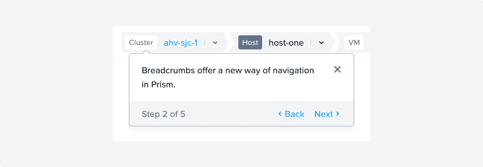
Use the word “step” only when the user must perform actions in the exact order shown in the carousel.
If the actions must be completed sequentially, label them clearly as steps. Example: Step 1 of 5
If the user can follow the content in any order, do not imply a sequence. Example: 1 of 5 or 1/5
Using “step” when no strict order is required can mislead users and create confusion in how they decipher the content.
We follow these basic rules while writing content for a tutorial:
Include only one piece of information or one action per step.
Keep each step concise and focused.
Limit the total number of steps to keep the experience light.
Do not overload steps with explanations or multiple decisions.
Actions
Use Got It or Done instead of Next for the final step.
The final action should clearly indicate completion or acknowledgement, not progression.
Images and accessibility
Use null alt text (
alt="") for decorative images.If an image conveys information, provide meaningful alt text that describes its purpose.
