
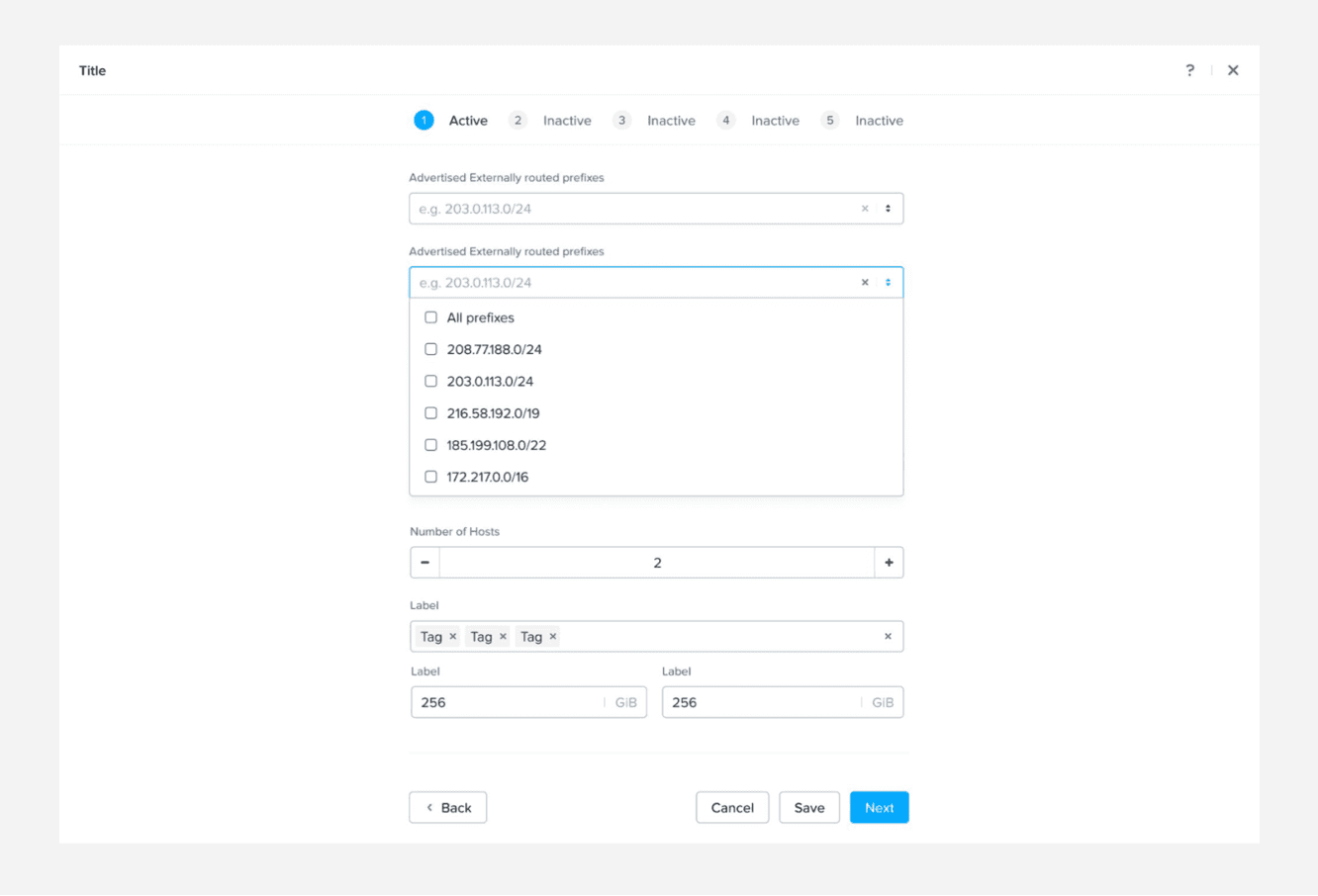
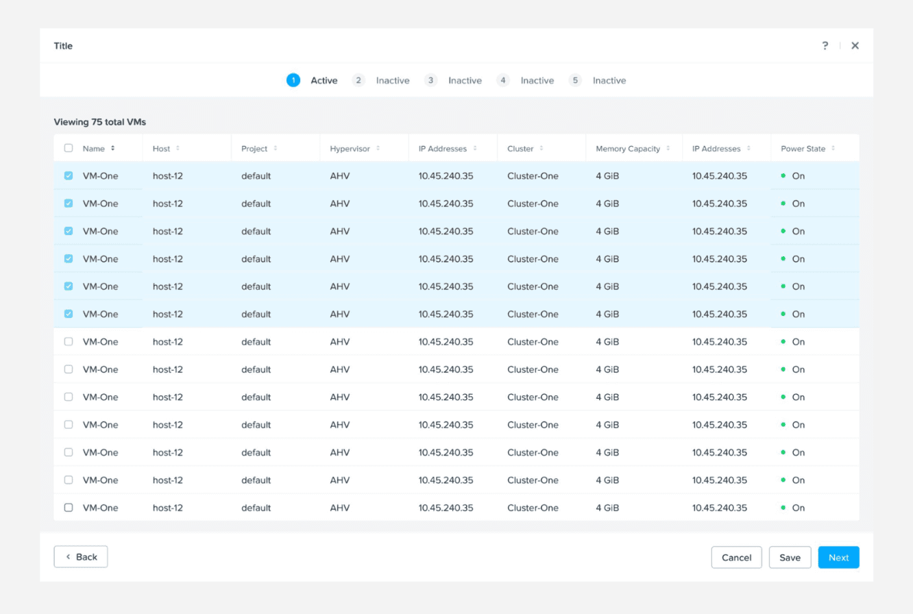
Content Guidelines
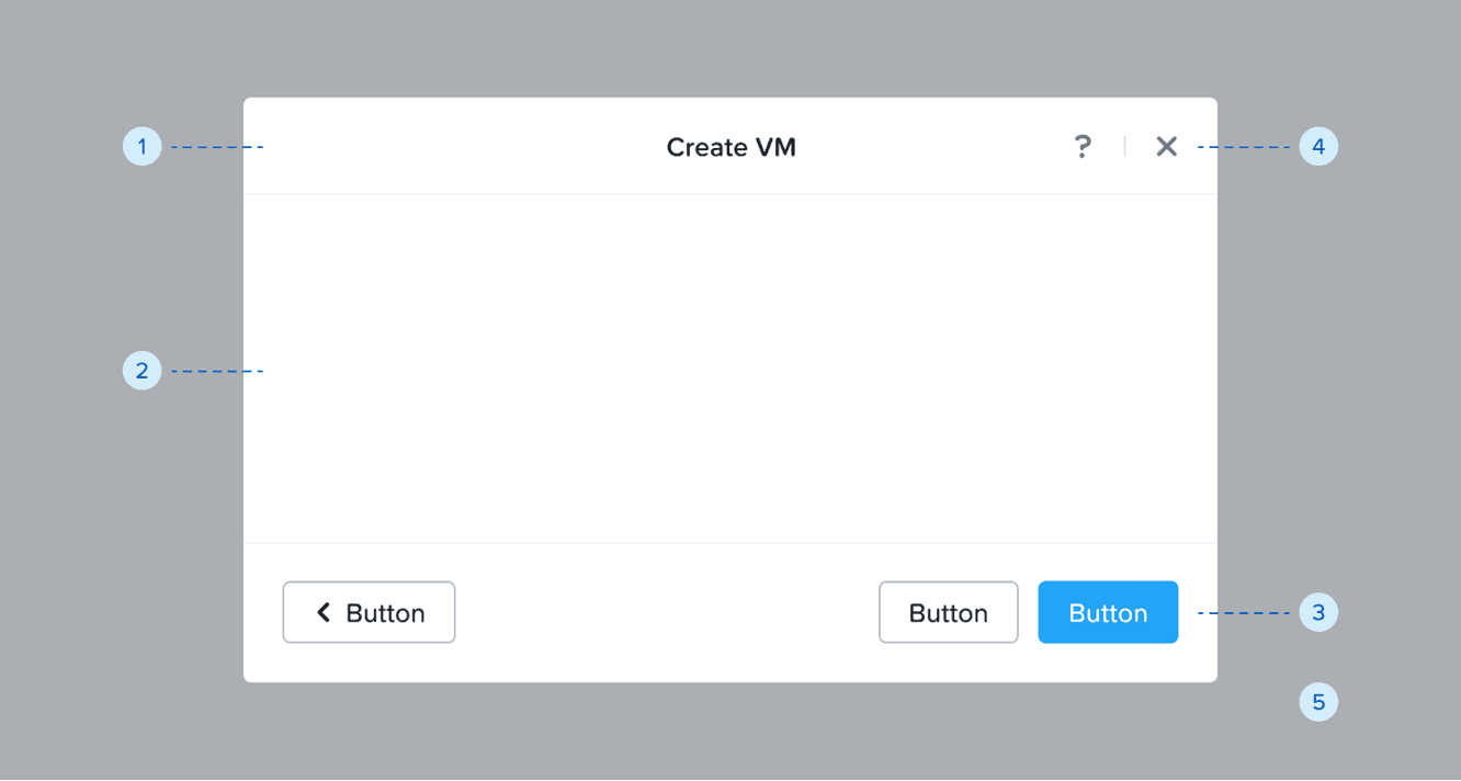
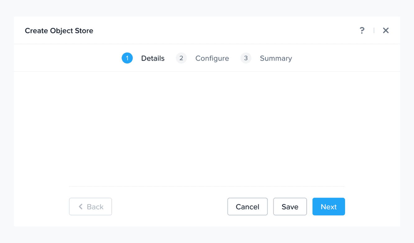
We use fullscreen modals for complex tasks or detailed information, and confirmation modals to validate major actions before they are carried out by the user.
We follow these basic rules while writing content for modals:
Voice: Be insightful and clear; do not use heavy jargon.
Tone: Be helpful and do not blame the user.
Language: US English
Voice Structure: Active voice
Casing
> For fullscreen modals: Titles in Title Case and descriptions in sentence cases.
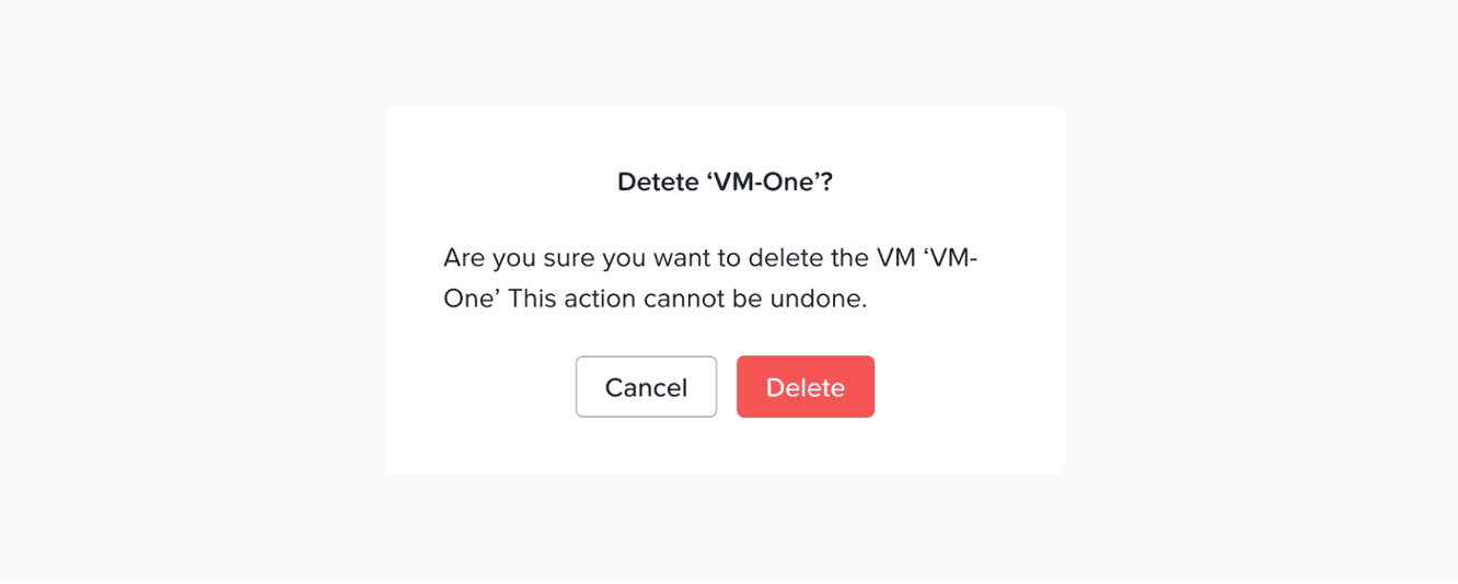
> For confirmation modals: Titles and descriptions both in sentence case.
CTAs always in Title CasePunctuation: Use no period for short sentences or sentence fragments. Use full punctuation only when the message is a complete sentence. Do not use exclamation (!), ellipsis (…), and question mark (?).
Words and phrases to avoid: Please, successfully, oops, sorry, uh-oh, something went wrong, you shall, you can.
❌ Don't: Are you sure?
Structure of an effective confirmation modal message
Title: Define the action on which we need confirmation from the user and align it with the primary CTA. Do not ask the user, "Are you sure?" as this does not carry enough context, reduces accessibility, and sounds informal.
Description: Convey what will happen if the user continues with this action e.g., if the said action cannot be undone, will it lead to any fundamental changes, etc.
Primary CTA: Represent the main action being confirmed—the action the user is intentionally choosing to perform.
Secondary CTA: Let the user safely exit the action without making any changes.
Examples
Scenario 1: The user is trying to delete an external storage
Content
Title: Delete external storage Dell PF 1
Description: If you continue with the delete, this storage configuration cannot be recovered
Primary CTA: Delete
Secondary CTA: Cancel
Scenario 2: The user is trying to disable Flow Network Security
Content
Title: Disable flow network security
Description: If you continue to disable, all security policies in Monitor or Enforce mode will be deactivated. This will remove protection from the VMs defined in these policies.
Primary CTA: Disable
Secondary CTA: Cancel