Alert Banner

24.7

Banners are placeholders for alerts displayed at a section or page level.

Alert Banner

24.7

Banners are placeholders for alerts displayed at a section or page level.

Alert Banner

24.7

Banners are placeholders for alerts displayed at a section or page level.

Overview

Banners are placeholders for alerts displayed at a section or page level.

A blue banner, with the text banner text inside of it

Usage

Banners are placeholders for alerts displayed at a section or page level.

  • Use this component if you need to communicate to users in a prominent way.

  • Use a banner to notify a user about high-priority or time-sensitive changes.

  • Banners should allow the user to either ignore them or interact with them at any time

Anatomy

  1. Icon: Informs users of the kind of notification at a glance.

  2. Message: Provides detailed and actionable steps for the user to take.

  3. Link (optional): Allows users to address the banner or navigates them to a page with further details.

  4. Pagination (optional): Use when there are multiple banners.

  5. Close button (optional): Closes the banner.

A diagram of a banner including icon, text, pagination and close buttons

Severity

Examples of banner types inclduing, a blue, green, yellow and red examples.
  • Info: use this in most cases where you notify a user of a change.

  • Success: use this to confirm that an instruction from the user was processed successfully.

  • Warning: use this for critical information when informing users about a potentially unfavorable situation. If the issue requires immediate attention, use an error alert.

  • Critical: Use this for critical information that's preventing a user from continuing a flow and if there's action required on their end to resolve the issue.

Variants

Default

Banners should always include an icon.

Examples of the correct usage of icons in banners

With Link

Use underline instead of blue in links and banners.

Examples of the correct styling of links in banners

With Pagination

Use pagination when there are multiple banners, sorted by chronological order.

Examples of pagination inside baners

Inside Modal

Full-page banners align with the width of the page, not the content.

Examples of positioning inside modals

Section Banners

Section banners align with the width of the content, have rounded corners.

A banner example showing a generic error message followed by an input field with more specific details

With Multiple Lines

The contents of a banner should be as succinct as possible. Only display the most important piece of information.

An exmaple of a multi-line banner

Content Guidelines

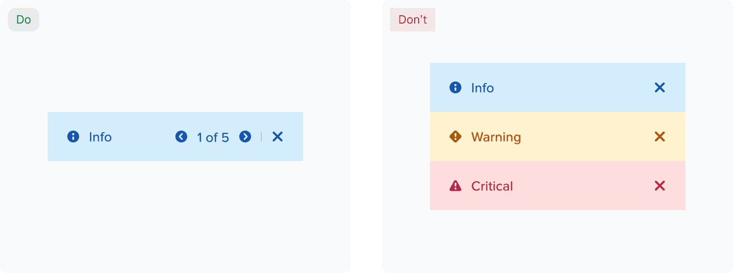
We use alert banners to communicate system status, warnings, errors, and other important information. They must be clear, concise, and actionable so users can understand the situation and take the right next steps.

We follow these basic rules while writing content for alert banners:

  • Voice: Be insightful and clear; do not use heavy jargon.

  • Tone: Be helpful and do not blame the user.

  • Language: US English

  • Voice Structure: Active voice

  • Casing: Sentence case and keep proper nouns as is; links in sentence case.

  • Punctuation: Use no period for short sentences or sentence fragments. Use full punctuation only when the message is a complete sentence. Do not use exclamation (!) and ellipsis (…).

  • Words and phrases to avoid: Please, successfully, oops, sorry, uh-oh, something went wrong, you shall, you can.

Structure of an effective alert message

We use alert banners for 4 levels of severity- info, success, warning, and critical.

An alert message should communicate one or more of the following:

  • What happened: Clearly state what triggered the alert or why the user is seeing it.

  • Why or how it happened: Briefly explain the cause, when this information is known or helpful.

  • What the user can do next: Indicate whether any action is required and clearly state the steps they should take.

  • Any alternate solution: Provide a workaround or next-best step if an immediate solution is not available.

Examples:

The info message in this example specifies what happened + what the user can do next.

"To ensure security, the system has generated an FNS policy based on the NSX migration rules. You may modify the secure entities; however, doing so can result in the policy being re-created as one or more separate policies, which may impact the overall security posture."

The warning message in this example specifies what happened + what the user can do next.

"There is a maximum rule limitation in FNS. Split the NSX policies into multiple FNS policies for migration."

The success message in this example specifies what happened.

"All 15 NSX policies applied to the selected VMs are migrated, and the equivalent FNS policies exist."

The critical message in this example specifies what happened + why it happened + what the user can do next.

"Unable to migrate 6 NSX policies attached to the selected VMs. These policies require FNS equivalents to preserve security configuration during migration. Create the corresponding policies manually in FNS before continuing with VM migration."

Accessibility

Icons

Banners have icons that announce the type of alert to screen readers and visually indicate what type of alert it is. That way, the background color isn't the only distinguishing feature between alert types.

Alt Text

Alt text is already provided for each alert type that describes it's informational purpose (i.e. Warning, Success, Error, or Information). Do not repeat the alt text of the icon in alert banner text content.

Examples of the usage alt-text in banners.

Help make this page more useful.

Help make this page more useful.

Help make this page more useful.