Notification

24.7

Notifications provides simple feedback about an operation in a small popup

Notification

24.7

Notifications provides simple feedback about an operation in a small popup

Notification

24.7

Notifications provides simple feedback about an operation in a small popup

Overview

A toast notification provides simple feedback about an operation in a small popup. It only fills the amount of space required for the message and the current activity remains visible and interactive.

Usage

Versions

24.7

⚠︎ 23.4

⚠︎ Legacy

This new dark notification is being implemented on the React library and will replace the white one.

⚠︎ 23.4: This is the first and current version of the React component that is actively supported.

This is the legacy notification component that still exists in many pages and slides in underneath the header.

⚠︎ The component is not actively supported.

Use toast notification to provide visual feedback when notifying a user of the outcome of an action they have taken.

  • Use to display brief, temporary notifications.

  • Use immediately after a specific event, such as a user action that does not relate to an object on the page.

  • Use to alert the user about a system-level error or potential risk.

Anatomy

  1. Main notification container

  2. Icon

  3. Message text

  4. Action buttons (optional)

  5. Expand button (for long messages)


Position

  • 20px from the right, 20px from the top, under the header.

  • Stack by pushing down new notifications - 10px gap

Severity, Icons, and Colors

  • Task: use the blue task icon when a task has been initiated.

  • Critical: use the red alert icon for any critical notifications.

  • Error: use the red error icon for failures and errors.

  • Success: use the green success icon to confirm a system-level success.

Props

Timer

  • By default the component should auto dismiss after 5 seconds

  • Auto dismissal could be turned off or set at a custom amount of seconds.

Actions

  • The component can have up to two button slots where one of them can be used as a dropdown.

Long Message

  • By default it only shows the first 2 lines of the message, and hides the rest behind an expand button. You may change this behavior by modifying that behavior.

Content Guidelines

Error Messages

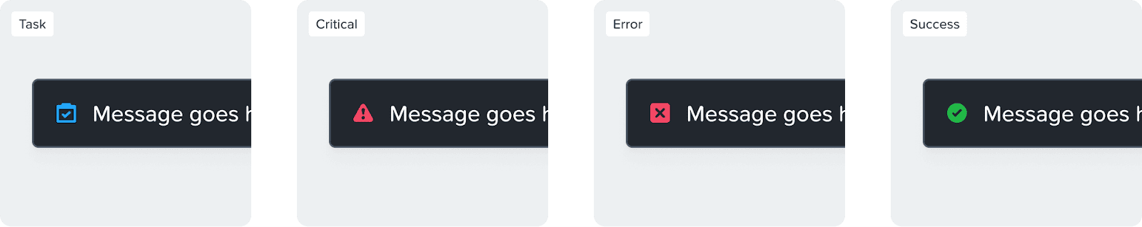
Error messages are one of the most critical parts of designing an experience. As a general thumb rule frame an error message as {problem} + {cause of error} + {solution}

DO

  • Provide appropriate actions that can be routed to solve the problem.

  • Be humble.

  • Speak it aloud like you are explaining it to someone.

  • Disclose information progressively.

DON'T

  • Use technical jargon.

  • Use exclamation marks.

  • Imply that the error is the user's fault.

  • Use negative words like "Access denied".

Accessibility

Icons

Notifications have icons that announce the type of alert to screen readers and visually indicate what type of alert it is. That way, color isn't the only distinguishing feature between alert types.

Alt Text

Alt text is already provided for each alert type that describes its informational purpose (i.e. Warning, Success, Error, or Information). Do not repeat the alt text of the icon in the alert banner text content.

Auto Dismissal

Auto dismissal for notifications needs to be set long enough to allow users with cognitive or motor disabilities the opportunity to read, understand, and interact with the notification. But as long as there's a place where users can access all alerts (etc. Alerts & Tasks pages), there isn't a specific requirement for the auto dismissal time.

Help make this page more useful.

Help make this page more useful.

Help make this page more useful.