Weight
Primary
Use primary links:
When there are a few links on the page
When you want to highlight an important link
When the links is part of a paragraph

Neutral
Use neutral links:
When there are multiple links in the same layout (e.g., tables or widgets)

Underline
Links adjacent to other text should always be underlined unless they have a visual indicator like an icon. This includes links in tables, paragraphs, and sentences. In summary:
An isolated link doesn't need to be underlined
A link with an icon doesn't need to be underlined
A link adjacent to other text needs to be underlined if it doesn't have an icon

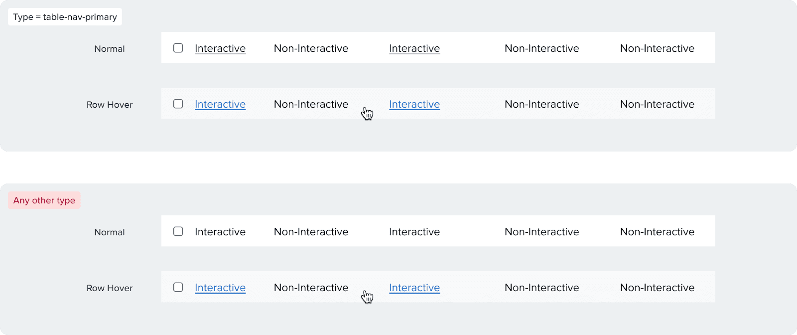
Tables
Links in tables need to be underlined since they are adjacent to non-interactive text. Make sure to use the "table-nav-primary" type and communicate that with the developers during hand off to have the proper font weight.
Variants & Props
Types
Primary: Blue
Secondary: Dark gray
Table-nav-primary: Dark gray and underlined, used for tables and has a lower font weight (400 vs 500)
Underline
Primary and secondary links are not underlined by default, but can be underlined
Table-Nav-Primary links are always underlined
Icons
Reinforces a link. Use these only when necessary and there is a clear action. Can be placed on the left or the right of the text.


New Window: we used to use this for external links before, this icon is no longer appripriate for that usage.
External Link: we use this icon for external links, e.g. links that open in a new tab, links that switch apps, or go to places that will cause a significant workflow switch or long loading times.
Chevron: we use this for links that move your forward in flow, or links that take you to a extended views from a summary.
Icon Link
Used to wrap a link inside just an icon.
Size
By default the link text size is 14px. Only use the small version (12px) when the link is part of a 12px body of text.
Content Guidelines
Links are used to guide users to documentation, supporting information, or related pages. These should be clear, scannable, and accessible, without competing visually with primary CTAs.
We follow these basic rules while writing links:
Structure: Write exactly what the link allows the user to do; avoid using generic links.
Casing: Sentence case and keep proper nouns as is
Punctuation: Do not use punctuation in links
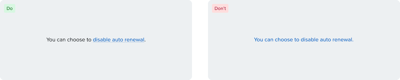
Placement: Place links either at the beginning or end of the sentence. Avoid inserting links in the middle, as mid-sentence links make the text harder to scan and reduce overall readability. Link the resource only, rather than the entire sentence.
✅ Do: Disable auto renewal, Read about recovery points, View events
❌ Don't: Disable, Read more, View
Accessibility
Use of Color
To pass WCAG contrast standards, links need to have either of the following:
The contrast ratio between the color of the link and the color of the surrounding text should be at least 3:1.
Links should be visually distinguishable from the surrounding text through means such as underline, or other visual indicators.
Since our colors don't always pass the contrast standard, we recommend underlines or supporting icons on all links adjacent to other text.
Text Button vs Link
Text buttons and links at the moment look identical even though they serve different semantic purposes. Text buttons, like buttons, are used to complete an action (Add Disk, Remove Category, etc.), while links only consist of URLs. This is an important distinction for screen readers, and because of that, make sure to communicate that with the front-end engineers when handing off. There are plans to differentiate the visual look between the components in the future.
Link Keyboard Navigation
[Enter] or [Space] to interact.
