Usage
Buttons communicate actions that users can take. They are typically placed throughout your UI, in places like Forms, Modal windows, Cards, and Toolbars.
Text on buttons should always use the Medium (500) text style.
You should only use one primary action per page.
If there isn’t any clear primary action, then consider using one or a combination of the other button styles.
Weight
Primary
Buttons call for action. We often use a primary button to draw attention to a page’s highest-priority action.

Secondary

Destructive

Transparent
Only applies for icon buttons. Used in other components like headers or inputs.

Text Buttons
Text buttons are used for the lowest priority actions, especially when presenting multiple options.
Primary
Use primary text buttons:
When there are a few buttons on the page
When you want to highlight an important button
When the links is part of a paragraph

Neutral
Use neutral text buttons:
When there are multiple links in the same layout (e.g., tables or widgets)

Underline
Text buttons adjacent to other text should always be underlined unless they have a visual indicator like an icon. This includes links in tables, paragraphs, and sentences. In summary:
An isolated button doesn't need to be underlined
A button with an icon doesn't need to be underlined
A button adjacent to other text needs to be underlined if it doesn't have an icon
Variants & Props
Icon + Text
Reinforces an action. Use these only when necessary and there is a clear action. Can be placed on the left or the right of the text.

Badge
This variant supports a badge to display an associated count. This variant adds visual signifiers; use cautiously.

Split
This variant supports main and related actions. Use when there is a clear main action to perform 90% of the time.

Icon Only
Use only if the icon is clear and space is limited.
We discourage the use of this.
Button Group
Used when there are multiple buttons related to each other
Only use secondary buttons in button groups
Communicate with the devs to use: noBackgroundFade={ true } separator="inset"
Content Guidelines
A call to action is a clear prompt—usually in the form of a button, link, or short text element—that tells the user exactly what to do next.
We follow these basic rules while writing a CTA:
Structure: {verb} + {noun}, the verb indicates that the button triggers an action, and the noun clarifies what to expect.
Casing: Title Case and proper nouns as is. Connectors (such as and, to, for, with) remain in sentence case.
Punctuation: Do not use any punctuation in a CTA
Placement: Primary CTA on the right and secondary CTA on the left for journey pages and confirmation modals
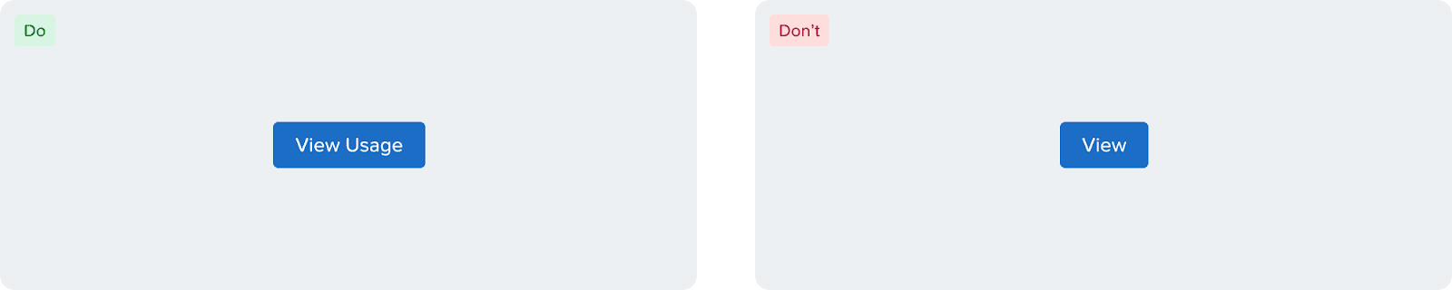
While writing CTAs, make sure to write complete CTAs and avoid using generic ones.
✅ Do: View Usage
❌ Don't: View, OK, Please View, Done!
Create vs Add: Use “Add” when the user adds to an existing data set and “Create” when something is being created from scratch.
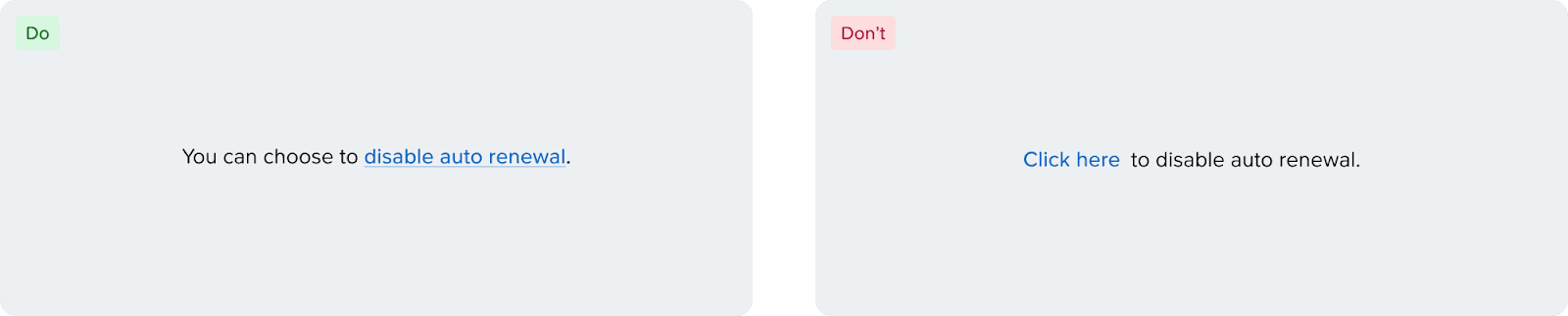
Avoid using generic text such as “click here” as link text. Clearly specify what the link does.
Accessibility
Disabled Buttons
By default, disabled buttons are not interactive. In case you need to display a message on why the button is disabled. It is recommended that the message is shown upfront instead of shown on the tooltip on hover. In case that is not an option, use the [aria-disabled] property to make the button focusable.

Alt Text
When using an Icon Button, make sure to use the [aria-label] property to define a label for the button to be accessible by screen readers. It is also required to show a tooltip on hover with the label of the button.

Text Button vs Link
Text buttons and links at the moment look identical even though they serve different semantic purposes.
Text buttons, like buttons, are used to complete an action (Add Disk, Remove Category, etc.), while links only consist of URLs. This is an important distinction for screen readers, and because of that, make sure to communicate that with the front-end engineers when handing off.
There are plans to differentiate the visual look between the components in the future.
Button Keyboard Navigation
[Enter] or [Space] to interact.
Split Button Keyboard Navigation
Button
[Enter] or [Space] to interact.
[→/←] to navigate between options.
[Enter] or [Space] or [↓] to open the menu and focus on the first menu item.
[↑] to open the menu and move focus to the last menu item.
Menu
[Tab] to navigate out of the dropdown item.
[Enter] or [Space] to open the menu and focus on the first menu item.
[↑/↓] to navigate between options.
[Esc] to close the menu and focus on the base component.
Button Group Keyboard Navigation
[Enter] & [Space] to interact.
[→/←] or [Tab/Shift + Tab] to navigate between options.
