Overview
The accordion component is used to show and hide a section of content.

Usage
The component can be used to show and hide optional, advanced, or less important sections.
The component can be used to show and hide sections when there’s too many of them.
Anatomy

Title + chevron: click area for expanding and collapsing the accordion.
Extra header content: additional information and controls for the accordion section that are always visible even when the accordion is collapsed.
Variants, Props, & Customization
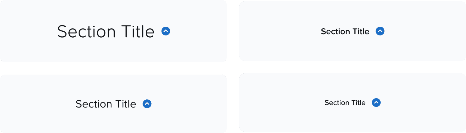
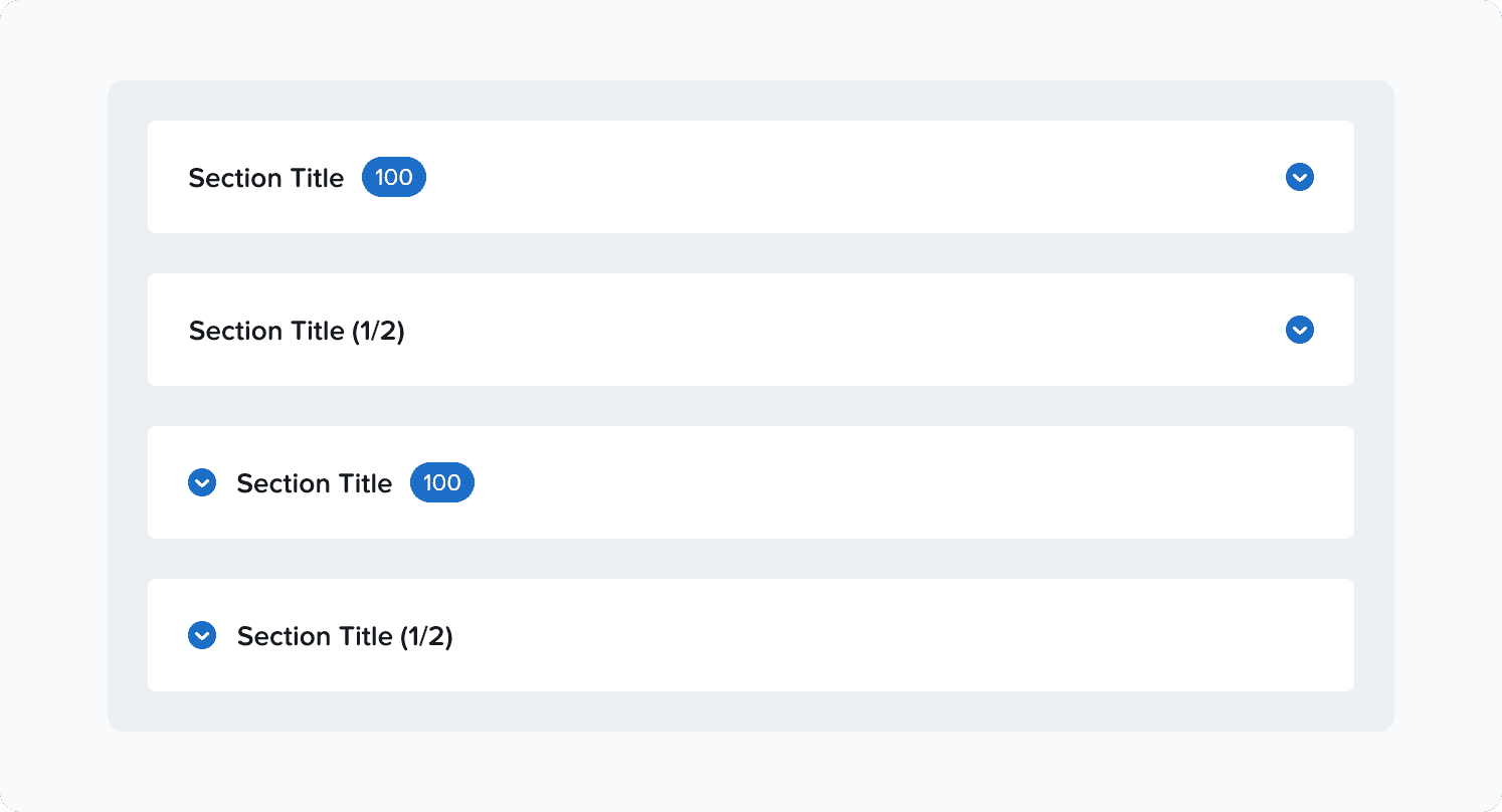
Title
Title text style can be customized. Use a text style that is appropriate and on the same level of other section titles in the same page.
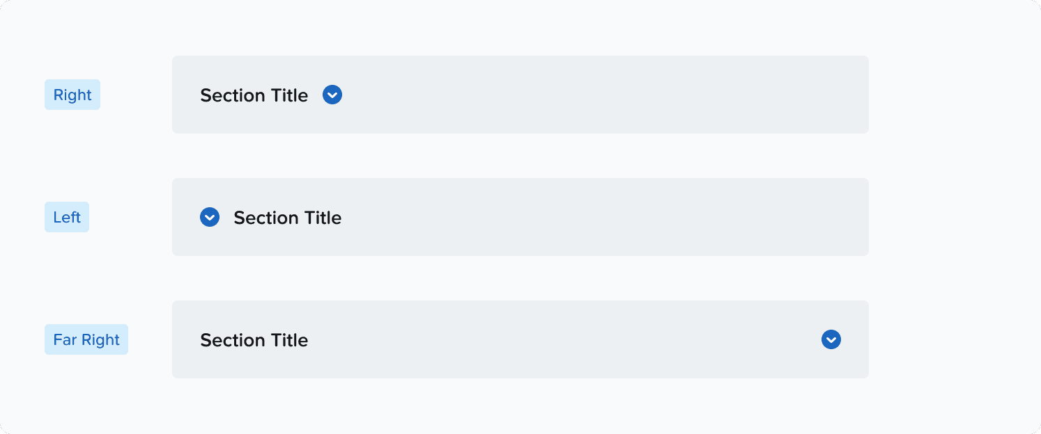
Chevron
Chevron can be placed in 3 different positions, depending on the use case:
Right, Left, and Far Right.
Change the variant as per requirement. Stay consistent with one chevron position within a flow, and avoid using different chevron positions within the same flow.
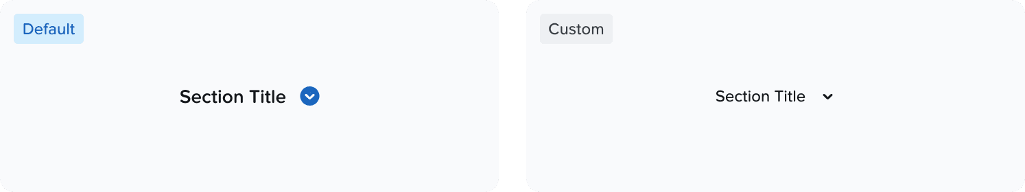
Chevron’s style can be customized.
We always recommend the blue circle chevron, only use other styles if there’s a strong reason.
Chevron's position cannot be customized at the moment other than the ones defined as a variant.
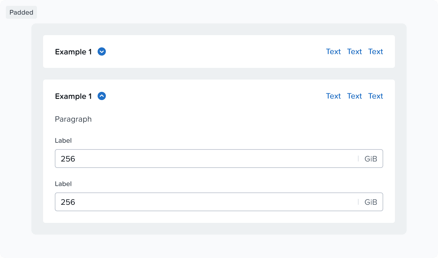
Padded
Padded accordions are used if accordion sections need more weight and separation from each other.
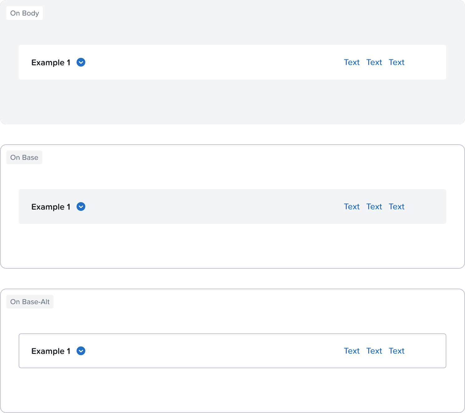
Use
color-background-basefor the background when the accordion is placed on color-background-body
Use
color-background-bodyfor the background when the accordion is placed on color-background-baseUse
color-background-base + color-border-separatorfor the background when the accordion is placed on color-background-base-alt
Extra Header Content
There are no specific guidelines on what to put there, but make sure that the content is similar or smaller to the title in height.
Do's & Don’ts
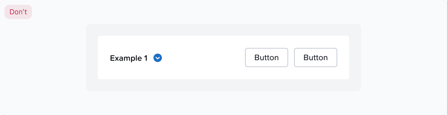
Nesting Accordions
Nesting accordions is possible, but not recommended as it doesn't make for an easy drilling down interaction.
Accordions are not meant to be parent layers to content, but rather just sections that can be hidden and shown.
If you need to nest accordions you might want to rethink the layout of the page.