Overview

The Table component is used to display structured data in rows and columns, allowing users to scan, compare, and analyze information efficiently.
Usage
Tables organize information in a systematic grid format, making it easy for users to:
Compare data across rows and columns
Sort and filter information
Select specific items
Navigate through large datasets.
Anatomy
Body Background & Color
When placed on:
Background-body:
background-base+ no borderBackground-base:
background-base-alt+ border-interactiveBackground-base-alt:
background-base+ border-interactive
Top Area
Title
The title does not come as a part of the component, each use needs to be formatted locally unless it's part of a bigger component like EBR. Here are some examples:
Viewing 3 clusters
1 selected out of 3 clusters
1 selected out of 3 grouped clusters
Viewing 1 grouped out of 3 VMs
Right Side
Actions and pagination sit together on the right side of tables.
Headers
Sorting
Column sorting is an optional function in tables, it can be set for specific columns
You can set the default sorting to be based on any column
Double Line
You can choose to break the column header title in two lines if it is going to save significant horizontal space. Three lines is too much and not recommended.
Row Headers
Row headers are basically an ID column, it helps screen reader users links cells in different columns to the ID
An entity list page and a properties tables are two distinct examples where row headers can be used
Row headers don't need have a distinct visual style, it's mainly a technical attribute
You can use lighter colored text (
--secondary-label) in properties tables and other small widgetsFor list views, keep the color as it is
Columns & Rows
Fixed Columns
Fixed columns are used when horizontal scrolling is enabled on a table
You can choose to fix any number of first/last columns
Column & Row Span
Column and row span can be used in column headers or regular cells
You can choose to fix any number of first/last columns
States
Widgets
Cells in the first column in widget tables have 20px left padding instead of 15px
Most widget tables use the first column as a row header instead of relying on column headers
Form Empty State
When tables are empty in Forms, we place a primary action for adding in the middle
After the first row is added, we show the add button as text button on the top right
Loading
We can use an overlay if the content is refreshing, or make the table empty if it's the first time.
Error
Table errors mostly have to do with fetching errors.
Variant & Props
Inline Filter
You can choose to add a string filter inside the table
This is not supported by EBR
Editable
⚠️ We do not recommend the usage of this patterns
Editable tables can be used an input form method
Inline editing can be used for editing quick editing on the man table
Tree View
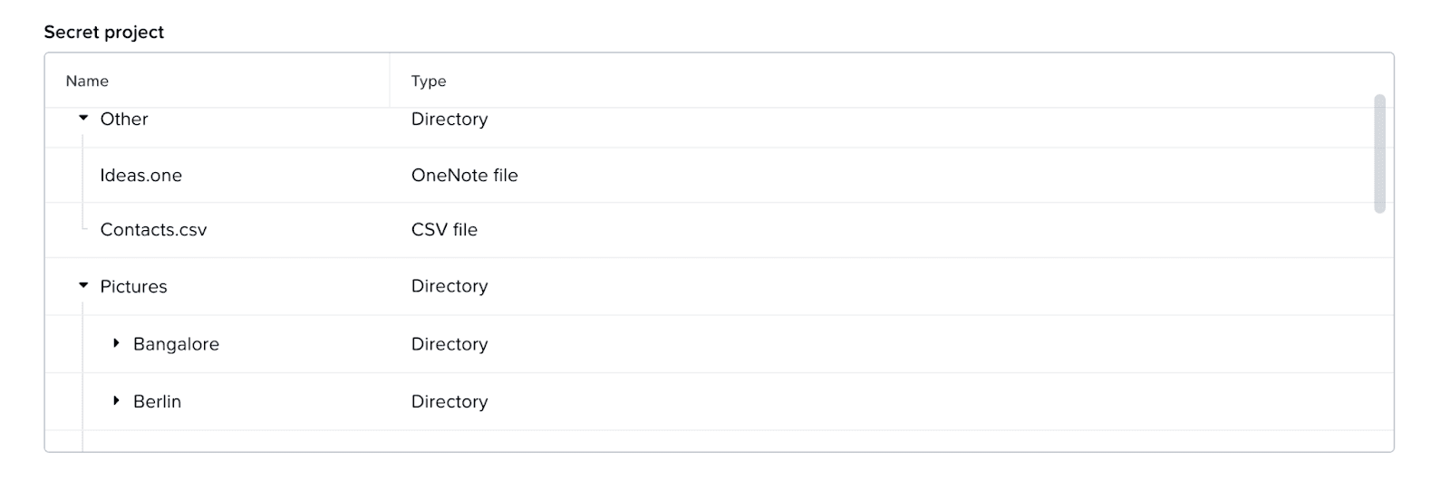
Tree views are for use for multiple layers of nesting in the table
We don't support checkboxes at the moment for tree views
Reordering
Reordering columns is a prop that can be turned on
Users can drag and move columns through the column header
This interaction is not keyboard accessible, so we you need to have an external way of reordering columns like EBR
Reordering rows is a prop that can be turned on
The interaction is keyboard accessible
Resizing Columns
Resizing columns is a prop that can be turned on
We recommend setting minimum widths to as expanding a column shrinks the other column facing it
Nested Content
Nested content areas are free form and can be used for any type of content
Nested tables are the most common example
Expanded Rows
Expanded show additional rows that retain the same columns of the main table
Accessibility
General
For sorters, provide proper role and state attributes for sort controls for screen readers to be able to convey information.
Pagination status must be able to be conveyed by screen reader (i.e. 1 - 20 of 100 items).
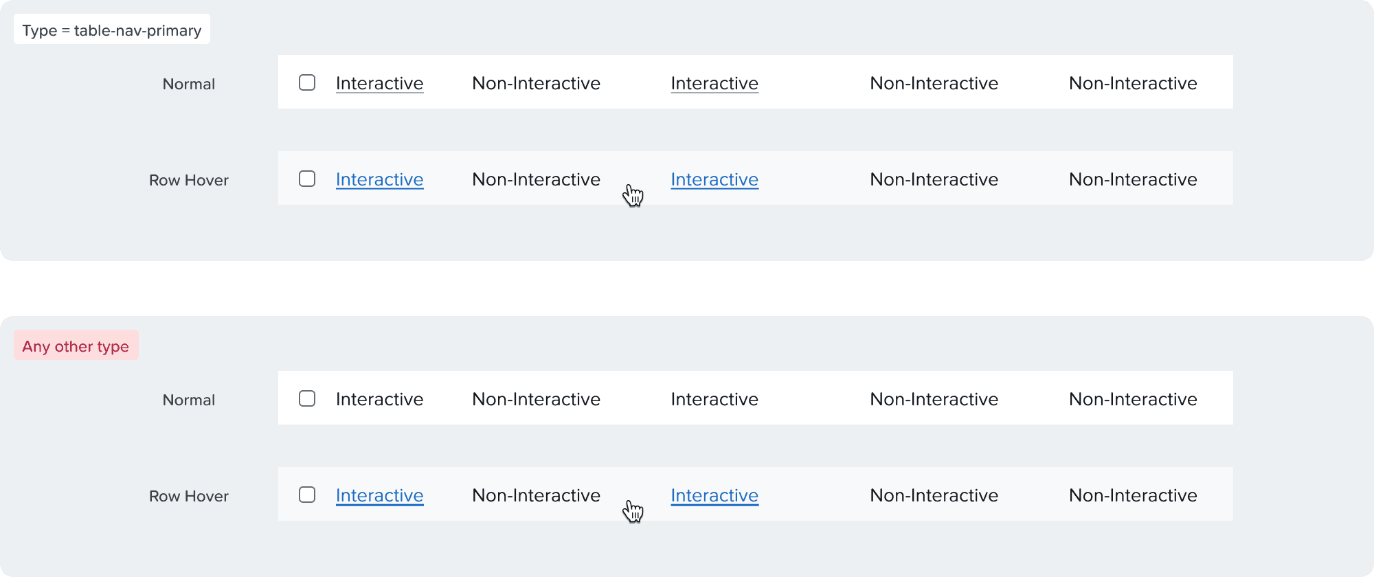
Links
Link must always be underlined. Use the table-nav variant so links have the proper text weight.
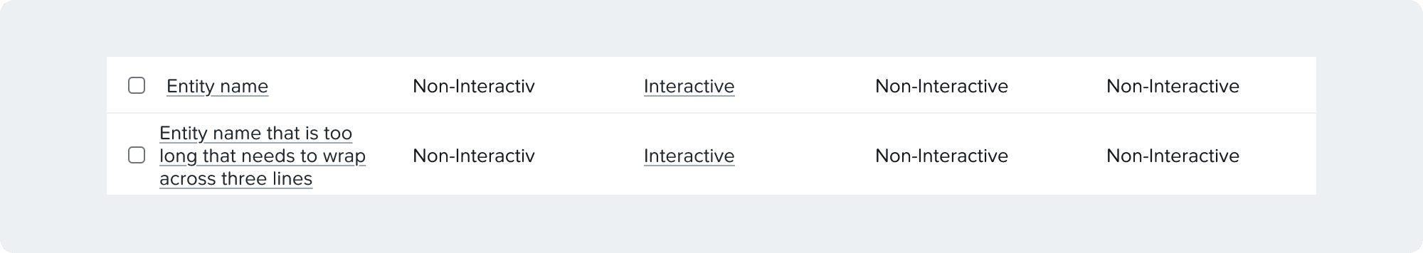
Truncation & Wrapping
Truncation is heavily discourage due to accessibility and performance reasons
Content should always wrap
Other cells become middle aligned when the row gets taller
Keyboard Navigation
Tab order:
Pagination controls
Column headers
Data rows
Pagination
Retain focus on disabled chevrons.
Column titles:
Focus on select all checkbox. a. [Space] to select checkbox.
Focus on individual column sorters. a. [Enter] or [Space] to sort column.
Tab to navigate to the first data row.
Data rows:
Focus on the row checkbox.
Focus on individual interactive content
Responsiveness
To make the table responsive:
Make sure to set minimum widths for each column to enable horizontal scrolling in smaller sizes
Fix the first and/or last columns if needed
Scrolling
Column headers are always sticky when scrolling
In most pages we use pagination, but infinite scrolling is preferable if there are no backend limitations
You can choose to fix any number of first/last columns
Grouping
Today you can use tabs to group elements inside a table
EBR specific documentation is referenced for group by functionality