REMs
REMs (Root EMs) are relative units in CSS that scale based on the root font size. They make designs responsive and scalable.
We are converting measurements to rems for web implementation. In Figma, we continue to use pixels because Figma only supports pixel units. Conversion rate: 1 rem = 16px.
Sizing Methods
Fixed sizing: A static width or height, used when exact dimensions are required.
Fill sizing: Expands to fill the available space in a container.
Hug sizing: Adjusts automatically to fit the content inside.
Min height & width: Ensures elements don't shrink below a certain size.
Max height & width: Limits how large an element can grow.
Examples: We are moving away from fixed sizing in favor of combining padding with min and max constraints to support responsiveness.
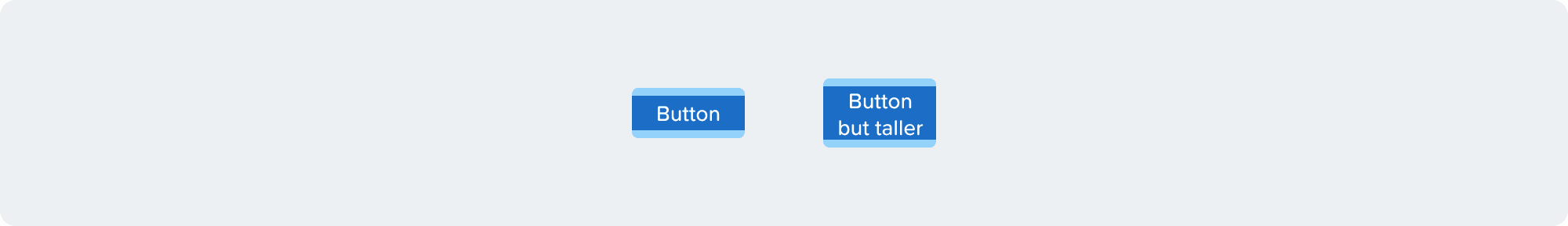
Button Example: Use a min-height with flexible padding.
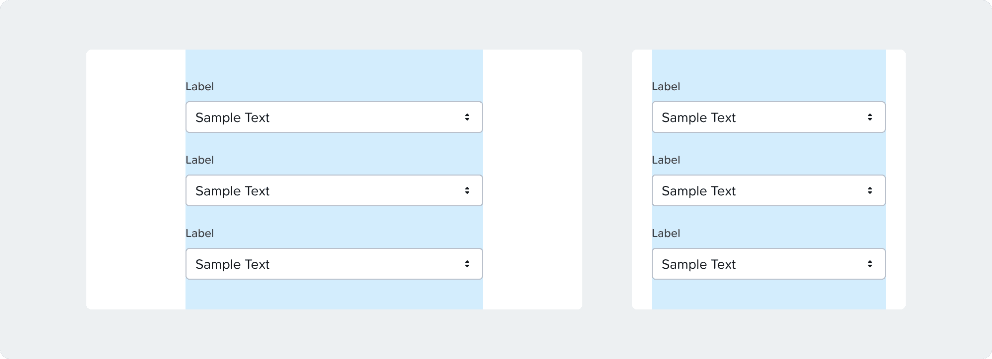
Form Field Example: Use max-width with padding to adapt to screen size.
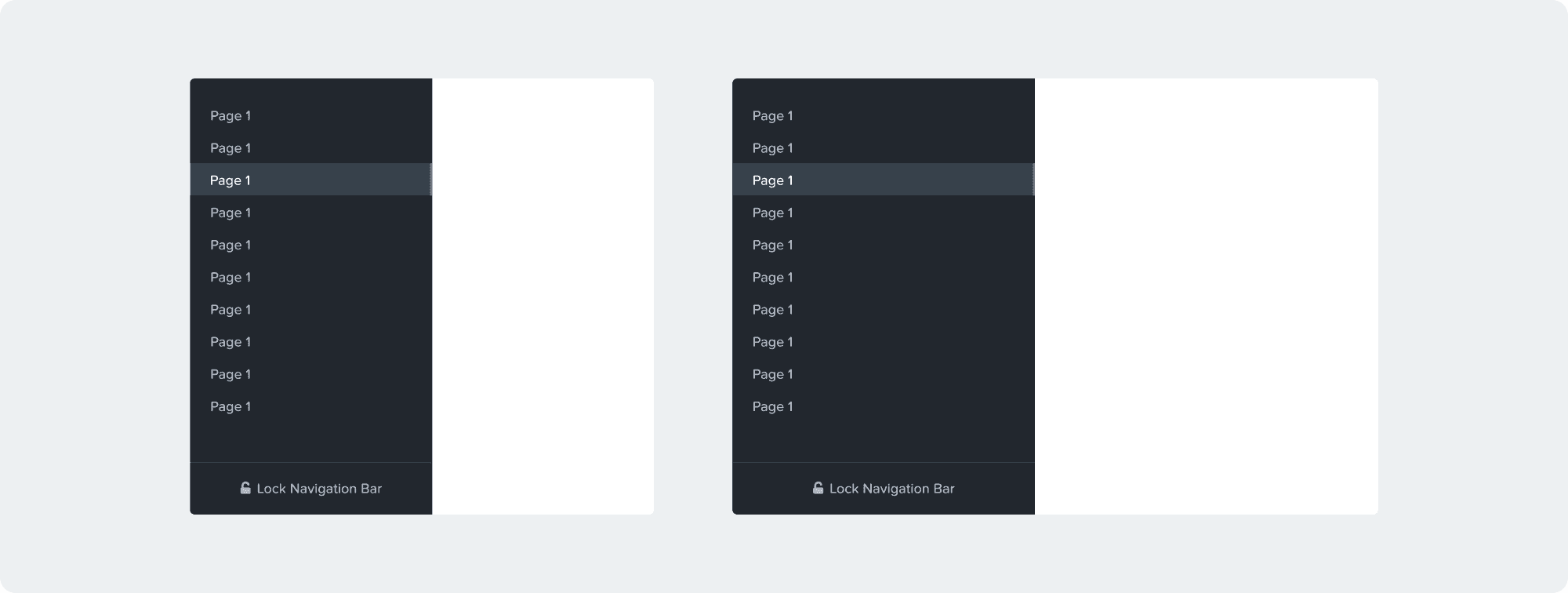
Menu Example: Use a percentage width with min and max constraints to ensure responsive behavior.
Working with Spacing Tokens in Figma
All components and templates should come with spacing tokens applied.
Designers should apply tokens for custom layouts or components.
Tokens aren’t required everywhere; niche values without corresponding tokens can remain un-tokenized.
Tokens should be used semantically; don’t pick a token just because it matches a size. Token values may change, and using them correctly ensures design consistency.
Engineers can inspect spacing tokens in dev mode.
The visual design team will review token usage during VD reviews and FnF reviews starting Kronos.
Figma FnF mode can highlight areas where tokens are not applied.
General Tokens
General tokens represent basic spacing units reused throughout the design system.
Name | PX | REMs | Example |
|---|---|---|---|
None | 0px | 0 rems | Used when no spacing is needed |
Gap
Used for padding, margins, and gaps.
Name | PX | REMs | Example |
XXS | 2px | 0.125 rem | Very small spacing |
XS | 5px | 0.3125 rem | Extra small spacing |
S | 10px | 0.625 rem | Small spacing |
M | 15px | 0.9375 rem | Medium spacing |
L | 20px | 1.25 rem | Large spacing |
XL | 30px | 1.875 rem | Extra large spacing |
XXL | 40px | 2.5 rem | Very large spacing |
Border Radius
Defines the roundness of corners for UI elements.
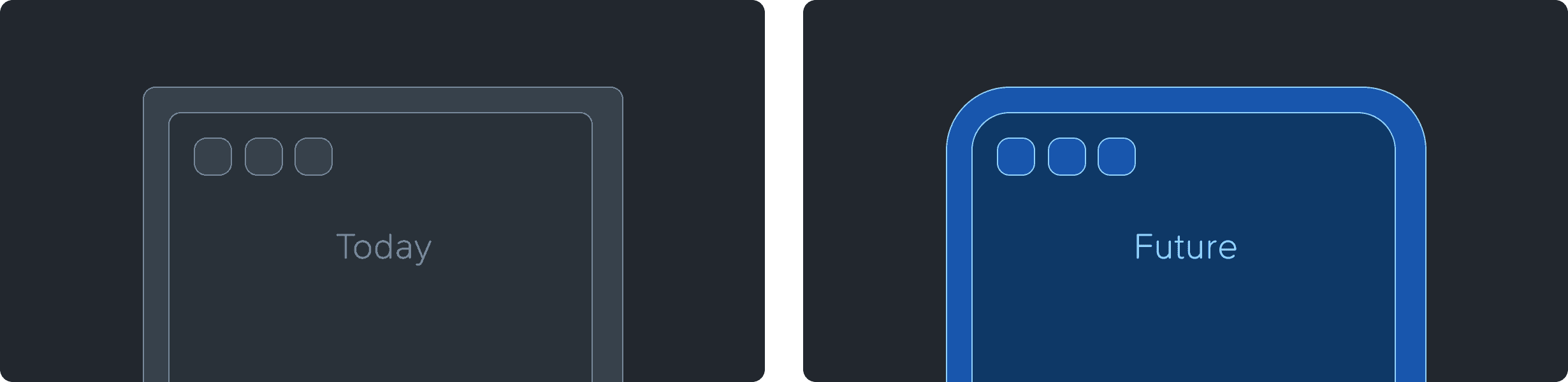
Goal & Ideal State
Proportional Scaling: Our long-term objective is to establish a system where component corner radii scale proportionally based on element size and container depth.
Current Limitations: The existing design language is constrained by a uniform 4px maximum, which limits visual variety and hierarchical depth.
Token Implementation: To prepare for a more flexible and scalable architecture, we are introducing a new set of design tokens across all components.
Transitional State: During this phase, several tokens will resolve to 4px. This "flat" mapping is a temporary measure to facilitate a seamless global update once the final proportional values are defined.
Name | PX | REMs | Example |
XS | 2px | 0.125 rem | |
S | 3px | 0.1875 rem | Focus indicators |
M | 4px | 0.25 rem | Buttons |
L | 4px | 0.25 rem | Widgets, tables |
XL | 4px | 0.25 rem | Side Panel, EBR table |
XXL | 4px | 0.25 rem | Page frame |
Max | 100% | 100% | Badges, radios |
Thickness
Used for stroke widths, bars, and rectangular objects.
Name | PX | REMs | Example |
XS | 1px | 0.0625 rem | Border, Separator |
S | 2px | 0.125 rem | Focus indicators |
M | 4px | 0.25 rem | Progress bars |
L | 10px | 0.625 rem | Small bar chart |
XL | 20px | 1.25 rem | Medium bar chart |
XXL | 30px | 1.875 rem | Large bar chart |
Semantic Tokens
Semantic tokens provide spacing based on usage context rather than exact numeric values.
Height
Name | PX | REMs | Example |
Min-List-Item-S | 32px | 2 rem | Menu item |
Min-List-Item-L | 40px | 2.5 rem | Table row |
Min-Badge | 20px | 1.25 rem | Badges |
Min-Interactive | 32px | 2 rem | Buttons, inputs |
Min-Widget-Sticky | 40px | 2.5 rem | Widget footer or header |
Min-Sticky | 50px | 3.125 rem | Alert banners, tabs |
Width
Name | PX | REMs | Example |
Min-Container-S | 240px | 15 rem | Menu |
Max-Container-S | 300px | 18.75 rem | Menu |
Min-Container-M | 450px | 28.125 rem | Side panel |
Min-Input-S | 120px | 7.5 rem | Number input |
Min-Input-M | 200px | 12.5 rem | Text input |
Max-Form-M | 500px | 31.25 rem | Form |
Max-Form-L | 700px | 43.75 rem | Form |
Min-Column-S | 80px | 5 rem | Column |
Min-Column-M | 120px | 7.5 rem | Column |
Min-Column-L | 180px | 11.25 rem | Column |
Square
Name | PX | REMs | Example |
Interactive-S | 12px | 0.75 rem | Radios & checkboxes |
Interactive-M | 20px | 1.25 rem | Anchor, carousel tab |
Interactive-L | 32px | 2 rem | Button, calendar day |
Icon-S | 8px | 0.5 rem | Icon |
Icon-M | 12px | 0.75 rem | Icon |
Icon-L | 14px | 0.875 rem | Icon |
Icon-XL | 18px | 1.125 rem | Icon |
Container Line Heights
Note: These are not actual line heights, but container heights for elements adjacent to text, such as icons or buttons, that need to align with the text.
Name | PX | REMs | Example |
H1 | 34 | 2.125 rem | Header 1 |
H2 | 22 | 1.375 rem | Header 2 |
Normal | 16 | 1 rem | Standard text |
Small | 14 | 0.875 rem | Small text |
Paragraph | 22 | 1.375 rem | Paragraph block |