Overview
There are four commonly used sizes in Illustration. Small (64 px), Medium Marketplace (96 px), Medium (128 px) and Large (440 px x 300 px). The most commonly used ones are Small, for widgets, and Medium, for empty states and other places. Large is only used for special purposes like onboarding, errors etc where there is a lot of space to be utilised. Medium Marketplace is only used in the marketplace pages
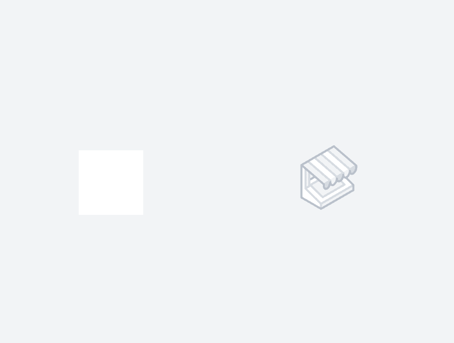
Small
64 x 64 px | Used inside widgets of Dashboards
Mostly used inside the dashboard, in modals and widgets. Low contrast helps set context without taking away too much attention from the content.
Padding: 20px padding between UI elements. 10px padding between content
Color: Greyscale only
Animation: Static illustrations, not animated.
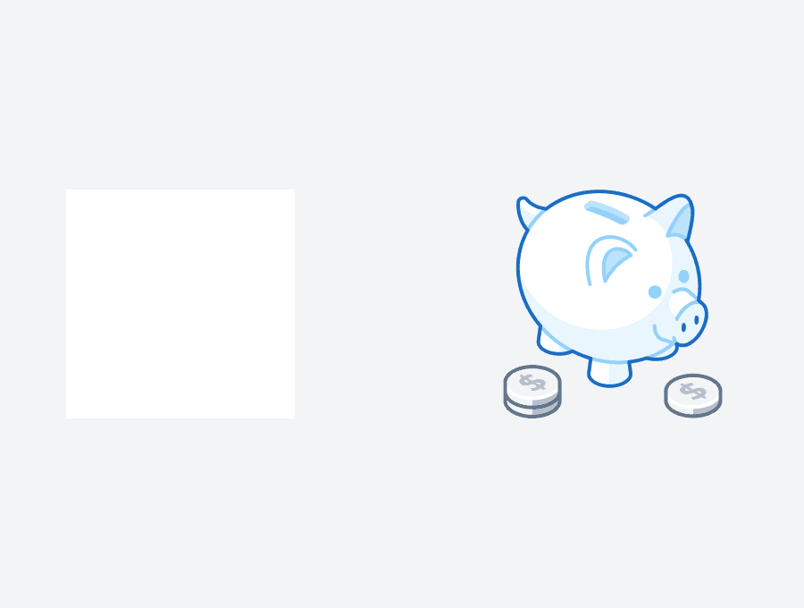
Medium Marketplace
96 x 96 px | | Used in the Marketplace
Special use-case where 64px is too small and 128px is too large.
Padding: 25px padding between UI elements. 10px padding between content
Colour: Grey, Blue, Red, Yellow(special cases only)
Animation: Static illustrations, not animated.
Large
440 X 300 px | | Used for full-page illustrations
Special case illustrations, used in places to visually set context and showcase a scenario. Areas like onboarding, upgrading, error pages etc. use these illustrations.
Usually the hero feature of the page, with other content acting as an aid.
Padding: 30px padding between UI elements. 20px padding between content
Colour: Grey, Blue, Red, Yellow(special cases only)
Animation: Can be animated.