Validation Types
Inline
How it Works
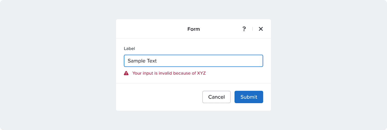
Error or warning of user input that is validated on the spot while the user is typing and is visually and programmatically announced through a warning or alert variant of input field components.
onBlur
How it Works
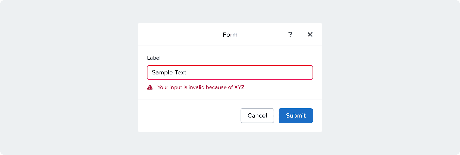
Error or warning of user input that is validated on the spot the user leaves that field before form submission and is visually and programmatically announced through a warning or alert variant of input field components.
When to Use
Use onBlur to give users immediate feedback after they leave a field, catching issues early without interrupting typing.
On-Submit
How it Works
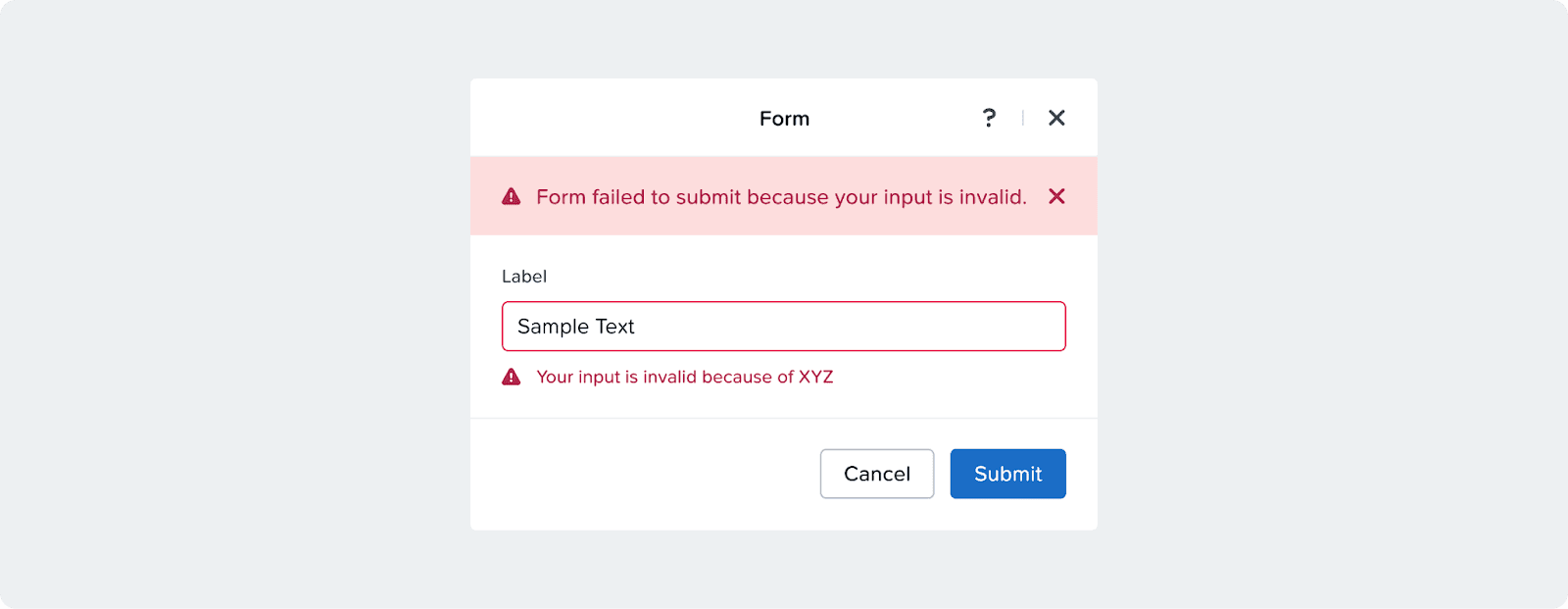
Errors of user input that is validated after form submission should be visually and programmatically announced in two ways:
First, the form must announce a high level alert of why the form has failed pointing them to the specific input errors. This should be announced through an alert banner. Then, on each error, the message can be announced locally through warning or alert variants of input field components.
Submit Button Behavior
When using on-submit validation, it’s recommended to always keep the submit button enabled so that users can submit the form and see what errors need to be fixed.
When to Use
Use onSubmit to run full validation before saving or sending data, ensuring all fields are checked together in one clear pass.
Input Labels
Help Text & Validation
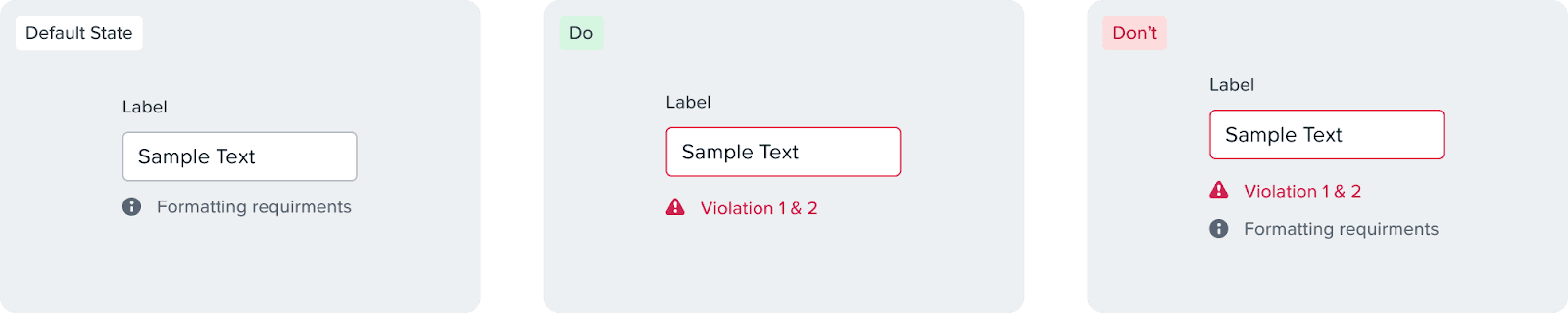
An error message should replace the help text and should not stack
While there are minimal downsides with the help text being temporarily hidden, we see that as necessary:
To minimize the layout changing and avoid moving elements
Reduce cognitive load and let the user focus on one thing at a time
Typing into an input with an error restores the help text immediately
Optional
In our UI, most fields are required by default. We typically highlight the label of any optional field.

Accessibility
Every form input must have a visible and programmatic label.
Formatting requirements should be displayed in a persistent manner
Sizing
General
Form width:
width-max-form(500px)Header → form gap:
gap-XL(30px)
Inputs
Less dense forms: use a single-column layout
More dense forms: pair related inputs to reduce vertical space
Tables
Default table width:
width-max-formWider tables: opt in to a custom width or max-width
Multiple custom tables: use the same width or max-width across all tables
Anchors, menus, and side containers
Width:
Container-S-pctMin width:
Min-Container-SMax width:
Max-Container-S
Help make this page more useful.