Components

Spec Library
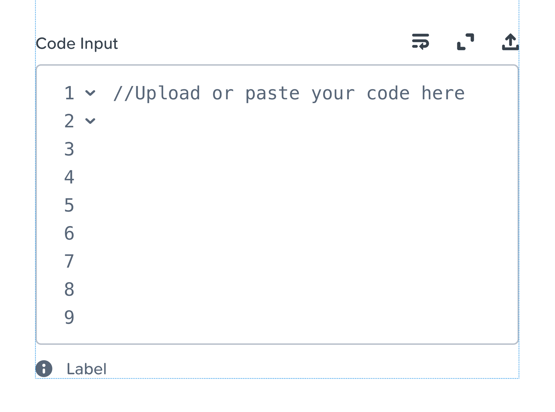
Source Code Input
Calendar
Dropdown
Going forward, the dropdown will use a separate menu component form the regular navigation one
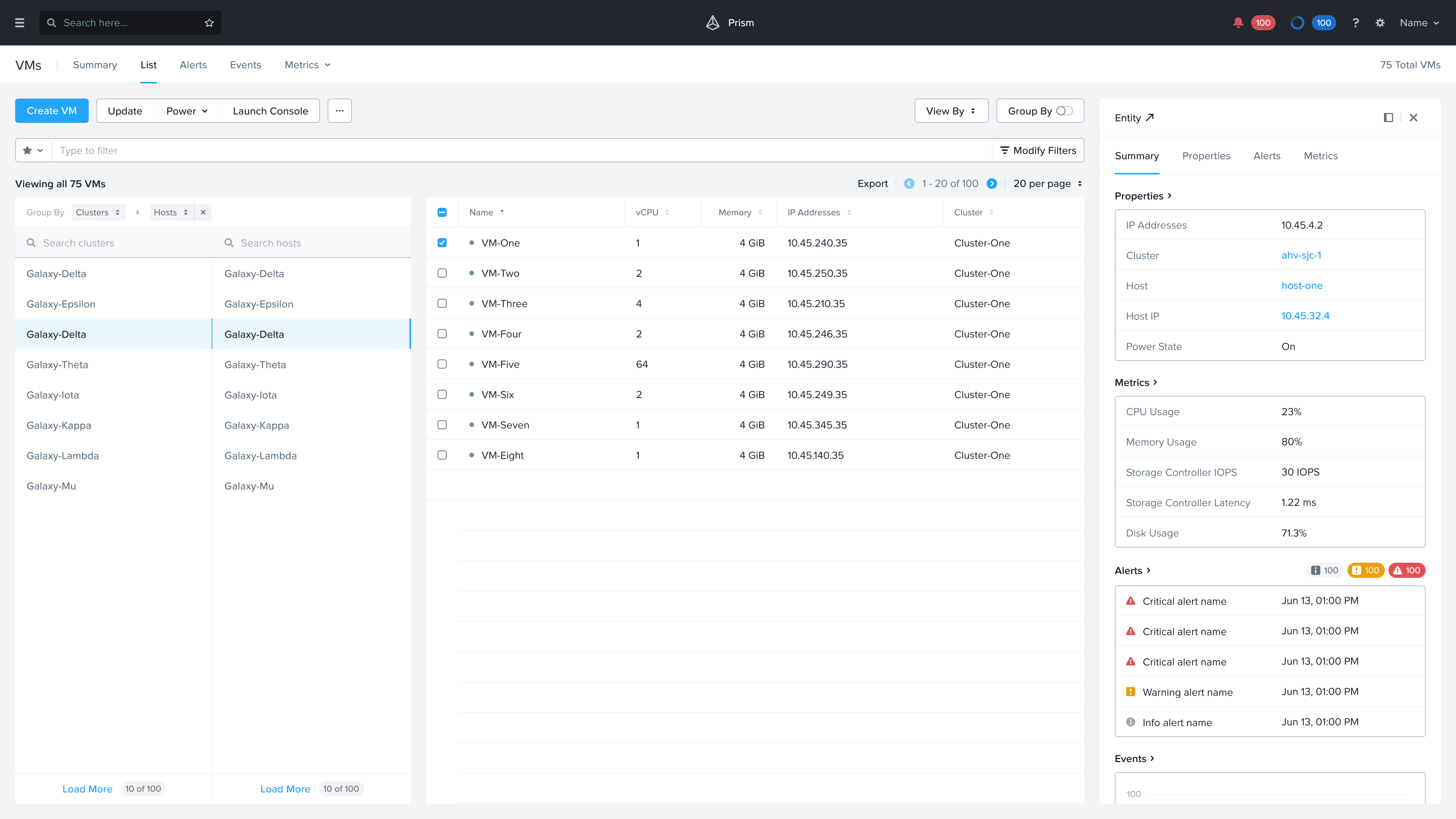
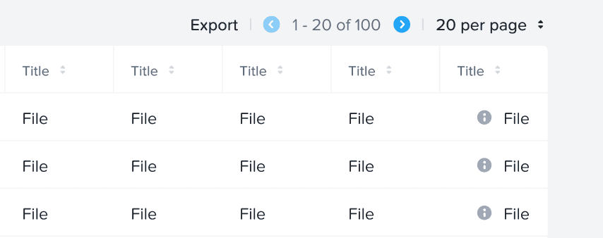
Table
Steps
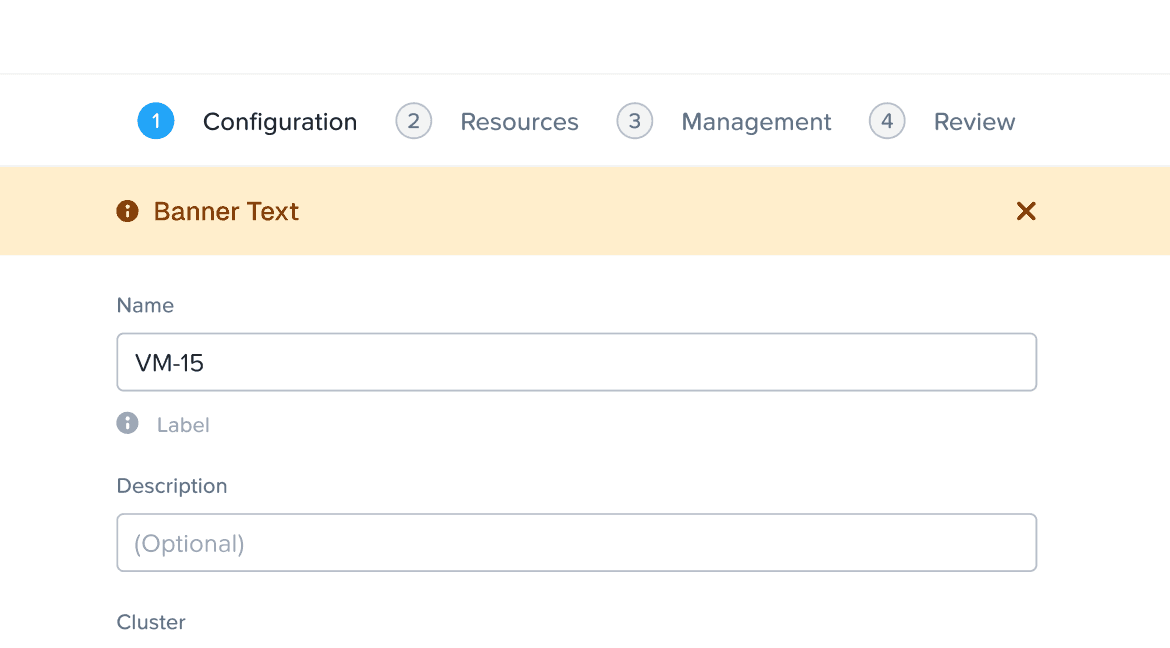
Alert Banner
EBR
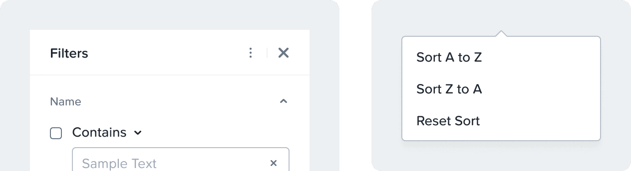
Filter Panel
Added option to sort filters
Group By
New layout that can be adopted
Design Library
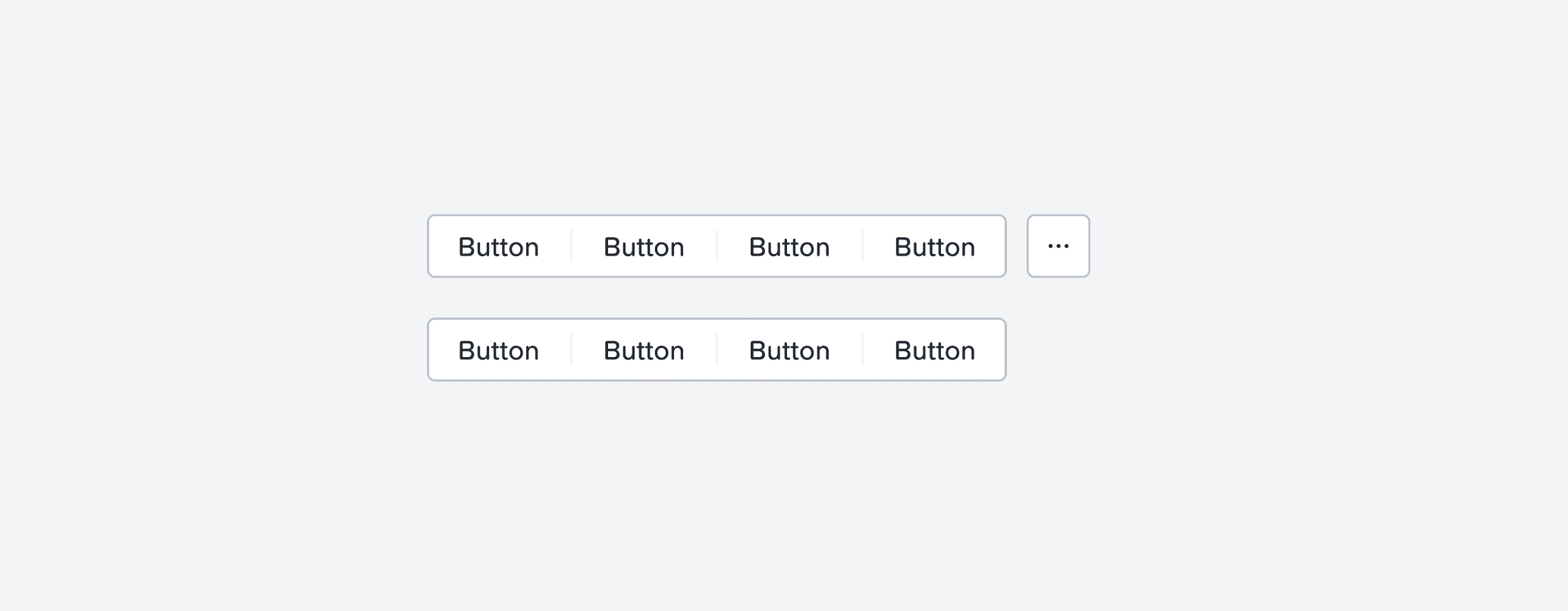
Button group component
Button Group has been added to the Design Library. The button group is ONLY available in the secondary state. Please do not change the color tokens to make it primary or destructive. Button group can have up to 5 actions in a group, or 4 actions and a more actions dropdown. For more actions, look out for the toggle to add an icon button. More actions go inside the icon button in a dropdown.
Condensed Anchor menu
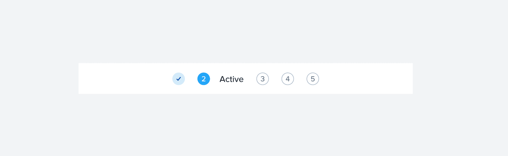
Condensed Step Navigation
Condensed step navigation has been added to the library. This is not a replacement or space saver. This component is to make the step navigation responsive for smaller resolutions. Please DO NOT use it as the main component.
Added a new variant in the table
Added a new variant called Left icon + Text [2] to the table cells. Example: last cell in the image below.
Added an improved spacing variant for the first cell in widget