Components

General
Due to accessibility concerns regarding color contrast and target size, we are working towards removing all custom scroll bar styling across out UI and components.
EBR
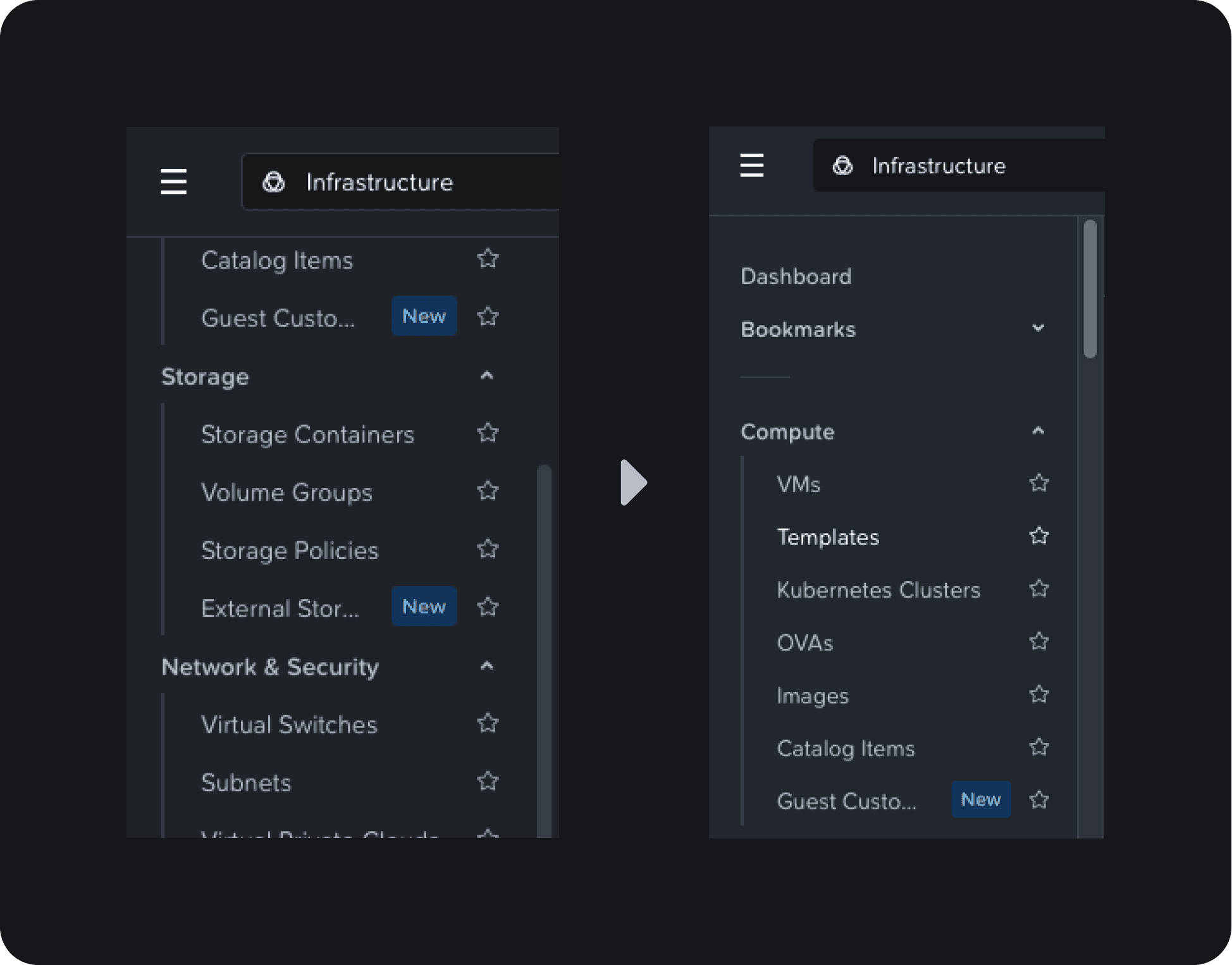
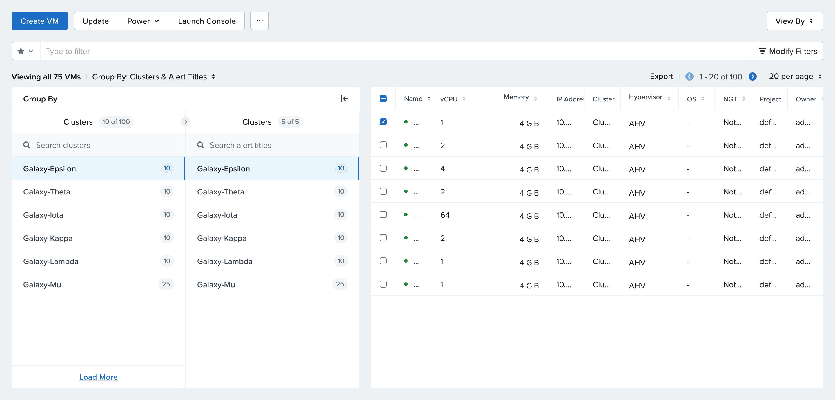
New Group By layout and design. Documentation here.
Uses a side menu vs tabs
Can load more entities and has search
Can add second level grouping to desired entities
The rendered for each group item is externalized, meaning you can add additional metadata in each menu item (group) in the form of badges and subtext.
Is opt-in only at the moment
Spec Doc
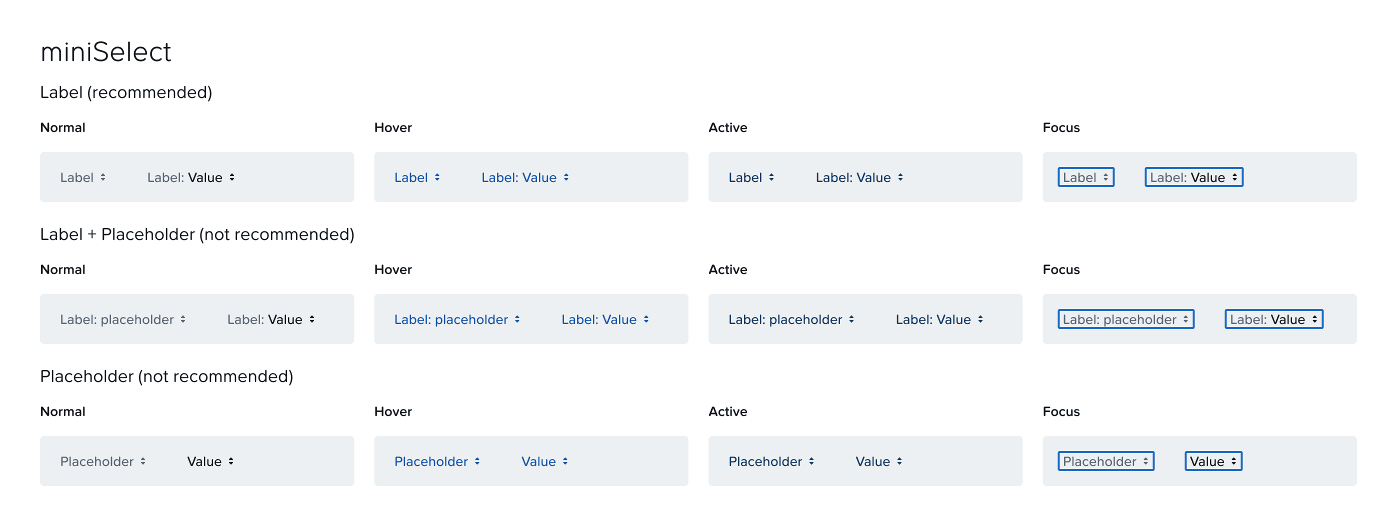
Added more examples to show mini-select with placeholders (not recommended)
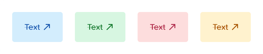
Added icon support for alert and inline links
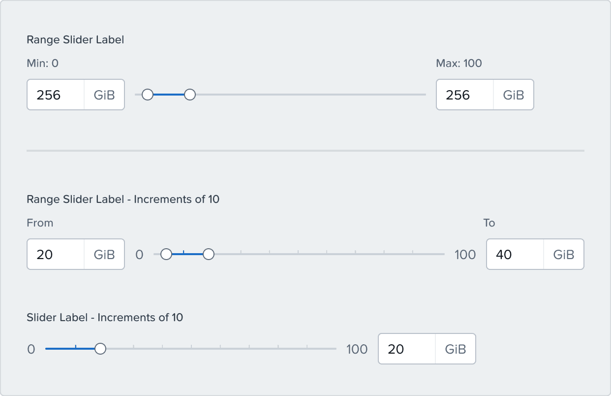
New slider labels for accessibility
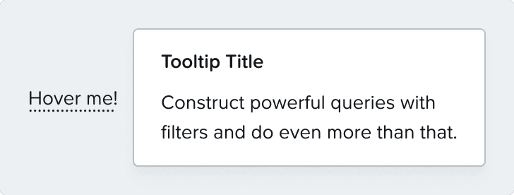
Tooltips will not have carets by default going forward
Design Library
Deprecated Input/upload or password, added new separte password and file input with instead of text
Fixed and issue with button group base/base-alt
Added new tag cell variant since the old
Exposed text as a property for badges & tags
Fixed fullpage modal footer spacing in wide version
Fixed a responsiveness issue with the dropdown component
New miniSelect with labels - deprecated old one
Fixed some tokens in the calendar component
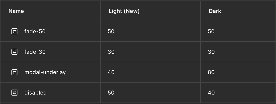
Added opacity tokens